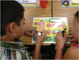
To help students approach these complex text forms, we printed out several types for them to explore. Each infographic was placed inside a page protector. Students used dry-erase markers to mark various elements of the info graphics. (You can do something similar with iPads and annotation apps.)
For example:
- Place a star next to the very first thing that catches your eye.
- Place a circle around the one word that best describes the topic.
- Place a square around important quantitative information
- Draw an arrow to point out the best graphic that helped you to understand the topic.
- Put a smiley face next to the data source.
- Draw an arrow showing the best pathway to follow to read all of the important information.
Students were able to realize that not all infographics read from left to right, top to bottom; not all infographics have sources listed and therefore may not be reliable; some infographics use much more effective visuals to make a point, and some have too much information! At the end of the lesson, students had to choose which infographic they are thought was the best and
If you would like to use some of the infographics we used in the lesson, you can find them at this weebly site.
 RSS Feed